Launching a first eyewear collection sounds exciting.
And it is.
But for most independent designer brands, the hard part does not start with inspiration. It starts after the sketches are done.
That is the point where a strong idea has to become a real product. A frame people can try on. A frame a boutique is willing to stock. A frame that still feels like the brand after sampling, revisions, polishing, hardware fitting, and bulk production.
This is where many first collections start to drift.
Not because the design was weak.
Not because the founder lacked taste.
But because the product that comes back from development feels just a little too generic. A little too heavy. A little too polished. A little too close to standard supply.
And in independent eyewear, that “little” matters a lot.
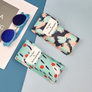
A first collection is not just a product launch. It is often the first real proof that a brand can turn its design language into something wearable, sellable, and consistent enough for retail.
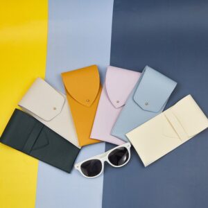
We saw that clearly in one project with Aurel Studio, an independent designer eyewear brand from Paris.
The founder came to us with a very clear visual direction. The collection had architectural lines, a soft vintage mood, and a refined color palette that was meant to feel quiet, not loud. On paper, it already had character.
But the early samples were not there yet.
The shapes were close.
The idea was visible.
Still, the collection did not feel premium enough for the boutique launch they had planned.
The balance was slightly off.
Some finish details felt too ordinary.
And the subtle color atmosphere the brand wanted was not fully coming through in the actual frames.
That is the real challenge with a first collection.
You are not just trying to make something beautiful.
You are trying to make something beautiful hold together in real production.
In this article, we want to talk about that gap.
The gap between a strong sketch and a strong retail product.
The gap between “this looks good” and “this feels like a real brand.”
And how independent designer eyewear brands can protect their identity during development, instead of losing it somewhere between the sample room and the shelf.
Part 2. Why First Collections So Often Lose Their Original Spirit
This happens more often than people think.
A founder has a clear idea.
The moodboard is right.
The sketches feel personal.
The color direction makes sense.
Even the first conversations with the supplier sound promising.
And then the samples come back.
Nothing is obviously wrong.
But something feels off.
The frame still looks close to the drawing.
The proportions are not wildly different.
The collection still carries some of the original concept.
It just does not feel as sharp anymore.
Not as intentional.
Not as refined.
Not as brand-specific.
This is where many first collections start to lose their original spirit.
Usually, it does not happen in one dramatic step.
It happens in small compromises.
A front shape gets adjusted a little to make production easier.
A temple end becomes slightly thicker for safety.
A finish gets polished in a more standard way.
A color that was meant to feel soft and controlled comes out flatter and more commercial.
None of these changes sounds disastrous on its own.
But put them together, and the whole collection starts to drift.
That drift is dangerous for independent designer brands.
Because independent eyewear is rarely built on obviousness.
It is built on nuance.
A slight tension in the line.
A certain balance between sharp and soft.
A color that does not shout.
A silhouette that feels familiar, but not generic.
That is the real product.
Not just the frame width.
Not just the lens shape.
Not just the material list.
And that is exactly why first collections are so vulnerable during development.
The designer is usually trying to protect an idea.
The supplier is usually trying to protect execution.
Both sides are working toward something practical.
But they are not always protecting the same thing.
A designer may care deeply about how a frame feels in the hand.
How the front sits visually when seen from three angles.
How the acetate edge catches light.
How the color feels slightly muted instead of bright.
A factory may look at the same frame and focus on a completely different set of priorities.
Can this hinge placement work consistently?
Will this temple shape affect stability?
Is this edge detail too fragile?
Can this finish be repeated in production?
Those are valid questions.
They matter.
But if no one bridges the gap between design intention and production logic, the result often becomes technically acceptable and emotionally weaker.
That is where many first collections go wrong.
They become more manufacturable, but less memorable.
And for a large commercial brand, that kind of softening may not destroy the collection.
For an independent label, it can change everything.
Because the first collection is not just introducing products.
It is introducing taste.
It is telling buyers, editors, retailers, and early customers what kind of brand this is.
If the first release feels too close to standard wholesale supply, people notice.
Maybe they do not say it that way.
But they feel it.
They feel that the product is well made, but not quite distinct.
They feel that the concept is there, but not fully resolved.
They feel that the brand has potential, but has not yet landed.
And that kind of reaction matters more than many founders expect.
Especially in boutique retail.
Boutique buyers are not only buying frames.
They are buying clarity.
They want to understand what makes this brand worth shelf space.
Why it belongs next to other curated names.
Why their customer should care.
If the first collection feels blurred, that answer becomes much harder to see.
This is why we often say that the first collection should not be judged only by whether it is beautiful.
It should be judged by whether it still feels like itself after development.
That is a different standard.
A stronger one.
A frame can be beautiful and still too generic.
A collection can be polished and still too safe.
A sample can be technically fine and still not strong enough to carry a brand into the market.
And for first-time independent brands, that is usually the real issue.
Not total failure.
Dilution.
The original idea gets diluted.
The emotional edge gets diluted.
The product language gets diluted.
What comes back is often close enough to approve, but not strong enough to build momentum.
That is why first collections need more than sampling.
They need interpretation.
They need restraint in the right places and correction in the right places.
They need someone in the process who understands that protecting the brand is not the same as simply following the drawing.
That was exactly the kind of gap we saw with Aurel Studio.
The vision was already there.
The taste was already there.
What needed work was the space between concept and object.
Not a total redesign.
Not a commercial rewrite.
Just a better translation.
And that is often the real work behind a strong first collection.
Part 3. A First Collection Is Not Just About Design — It Has to Survive Real Development
This is the part that many first-time founders underestimate.
A first collection does not move from sketch to shelf in one clean step.
It passes through pressure.
Sample pressure.
Material pressure.
Construction pressure.
Revision pressure.
Timing pressure.
And every one of those stages can quietly change the product.
That is why a first collection cannot rely on design alone.
It has to survive development.
That sounds obvious.
But in practice, many independent brands still evaluate their first collection in a very early-stage way.
They ask:
Does the shape look right?
Does the color feel close?
Does the sample photograph well?
Does it still reflect the moodboard?
Those are fair questions.
They are just not enough.
Because a first collection is not being built for a moodboard.
It is being built for reality.
Reality means the hinge has to feel right more than once.
The color has to stay convincing beyond one lucky sample.
The frame balance has to work not only in hand, but on face.
The finish has to support the price point after actual production, not just during approval.
And that is where things get harder.
A beautiful first sample can still hide weak points.
It can hide a temple structure that feels slightly unstable after repeated handling.
It can hide a front weight that seems fine at first, but feels wrong after real try-ons.
It can hide an acetate tone that looks refined in one light, then goes flat in store lighting.
It can hide finishing details that seem acceptable in a prototype, but lose precision when repeated across production.
This is why development is not just a technical phase.
It is a filtering phase.
It reveals whether the collection is actually strong, or just visually promising.
For independent designer brands, that distinction matters even more.
Because larger brands often have more room to absorb inconsistency.
They may have stronger name recognition.
Wider distribution.
More aggressive marketing.
A broader product mix.
An independent label usually does not have that cushion.
Its first collection has to do more work.
It has to introduce the brand.
Carry the pricing.
Earn retailer confidence.
Support photography.
Create emotional impact.
And still hold up as a real object in repeated handling.
That is a lot to ask from a few frames.
Which is exactly why first collections need a different kind of thinking.
Not just:
“Did we make the design?”
But also:
“Can this design hold its identity once real-world development starts pressing on it?”
That question changes how you look at everything.
Take color, for example.
At concept stage, color is often emotional.
You are choosing mood.
Temperature.
Atmosphere.
At development stage, color becomes operational.
Can this exact tone be achieved consistently?
Will the depth still feel right after finishing?
Will the color look sophisticated across the whole frame, not just on a small acetate chip?
Will the brand still feel like itself if this tone shifts even slightly?
The same goes for shape.
On paper, a shape may look elegant.
In sample form, it may still look elegant.
But once you add hinge mechanics, frame thickness, balance requirements, and wearing stability, that same shape may need support in places that affect its character.
If those decisions are made carelessly, the result is familiar by now:
The collection still looks “good.”
It just no longer feels fully intentional.
That is why first collection development is rarely about major corrections.
Usually, it is about protecting subtle things under practical pressure.
Protecting the line from becoming too safe.
Protecting the finish from becoming too standard.
Protecting the color from becoming too commercial.
Protecting the silhouette from becoming too generic.
And that kind of protection requires judgment.
Not panic.
Not perfectionism for its own sake.
And not endless revision.
Just clear judgment.
You need to know which details are structural.
Which are emotional.
Which are negotiable.
And which are not.
That is one of the biggest differences between simply making samples and actually developing a collection.
Making samples is about output.
Developing a collection is about decision quality.
That is also why some first collections feel strangely flat, even when money and effort were clearly invested.
The founder cared.
The supplier worked.
The timeline moved.
The samples improved.
But the wrong things were improved.
Edges got smoother, but less distinctive.
Construction got safer, but less elegant.
Color got easier, but less atmospheric.
The product became more practical and less specific.
And specificity is exactly what an independent designer brand cannot afford to lose.
In the case of Aurel Studio, this was the tension from the beginning.
The visual idea was already refined.
That was not the issue.
The real question was whether the collection could go through development without being pushed toward a more ordinary result.
Could the frames keep their quiet architectural feeling once structure adjustments began?
Could the color palette stay soft and controlled without becoming dull?
Could the finishing become cleaner without becoming generic?
Could the product become more wearable without losing its edge?
Those were the real development questions.
Not “Can we make it?”
But “Can we make it and keep it recognizably theirs?”
That is a much more demanding standard.
But it is also the standard that matters if the goal is not just to launch, but to launch with credibility.
Because a first collection is never judged only by the founder.
It is judged by buyers who see dozens of new brands.
By retailers who know when something feels unresolved.
By customers who may not understand the technical side, but can still sense when a frame feels special and when it feels merely fine.
And that is why development is not the stage where the original idea should fade.
It is the stage where the original idea should prove it can live in the real world.
That is what a strong first collection has to do.
Not just look good in concept.
Not just survive one sample round.
But move through real development and still come out feeling sharp, coherent, and worth believing in.
That is much harder.
But that is the job.
Part 4. The Aurel Studio Starting Point: Strong Vision, But Not Yet Retail-Ready
When Aurel Studio first came to us, the brand already had something many early labels do not.
It had clarity.
Not just taste.
Not just references.
Not just a moodboard full of beautiful images.
It had a real point of view.
The founder had a very specific idea of what the first collection should feel like.
Not loud.
Not decorative.
Not trend-driven.
The direction was quieter than that.
Architectural lines.
A slight vintage softness.
A more restrained color mood.
Frames that felt thoughtful, balanced, and subtly distinctive rather than immediately dramatic.
That part was already there.
And honestly, that matters.
Because some first collections struggle because the concept is still too loose.
Too many directions.
Too many borrowed references.
Too little internal logic.
That was not the problem here.
Aurel Studio knew what kind of brand it wanted to be.
The issue was something more difficult.
The early samples were close.
But “close” was not enough.
At first glance, they looked promising.
You could see the intention.
You could see the line.
You could see the brand trying to come through.
But the closer we looked, the clearer the gap became.
The frames did not yet have the kind of resolution a boutique launch needs.
And that difference is hard to explain unless you have seen it many times before.
Because the samples were not bad.
They were not messy.
They were not cheap-looking.
They were not obviously underdeveloped.
They just were not fully there.
The collection still felt like a strong concept in progress, rather than a finished retail statement.
That showed up in several ways.
Some of the front proportions were visually close to what the founder wanted, but not quite carrying the same tension.
A line that should have felt controlled felt slightly softened.
A shape that should have felt elegant felt a little more standard in object form than it did in the drawings.
The temple end was another example.
The original intention was clear: it needed to feel fine, refined, almost light in the hand.
But once translated into sample form, that same area started affecting overall balance.
The slimmer expression was right for the brand, but the physical result needed more discipline to work as a product.
Then there was the finish.
This was a big one.
Aurel Studio did not want a frame that looked aggressively polished or overly commercial.
The collection needed a more restrained, composed surface quality.
Something that felt premium, but not loud about it.
The early samples were clean enough.
But the finish was still leaning too close to standard supply logic.
Too familiar.
Too easy.
Too generic in the way light moved across the frame.
And when a brand is trying to build identity through subtlety, that kind of generic finish can quietly flatten the whole collection.
The color story had a similar issue.
On paper, the palette was very strong.
Muted tones.
Controlled greys.
A softer vintage direction without becoming nostalgic in a costume-like way.
But in physical form, some of that atmosphere was getting lost.
The colors were technically close.
Still, they did not yet hold the same emotional temperature.
They felt more literal than intended.
Less nuanced.
Less layered.
Again, not wrong.
Just not strong enough.
And that is the kind of difference that matters a lot in independent eyewear.
Because a larger commercial collection can survive with some bluntness.
It can survive if one color feels a little flatter than planned.
It can survive if the finish is a little more standard than distinctive.
A first collection from an independent designer brand usually cannot.
It needs precision earlier.
Not perfection in some unrealistic sense.
But precision in what the brand is trying to say.
That was the real starting point with Aurel Studio.
Not rescue.
Not reinvention.
Translation.
The brand did not need help inventing a stronger aesthetic.
It already had one.
What it needed was help making sure the physical frames could carry that aesthetic all the way into retail.
That is a very different job.
And it requires a different kind of conversation.
Because at this stage, the questions are no longer broad.
They become very specific.
Why does this edge feel more ordinary than it should?
Why does this shape look calmer on paper than it does in acetate?
Why does this color lose sophistication once it becomes a full frame instead of a material chip?
Why does this temple feel visually right but physically unresolved?
Those were the kinds of questions that mattered.
Not because the collection was failing.
But because it was close enough to be worth protecting properly.
And that is an important point.
The most interesting projects are often not the ones with obvious problems.
They are the ones with strong bones and subtle friction.
Projects where the brand identity is already visible, but the product still needs careful correction before it can carry that identity confidently.
That was exactly where Aurel Studio stood.
The founder was not looking for someone to simplify the idea.
And she was not looking for someone to turn it into a more commercial line.
She wanted the opposite.
She wanted the first collection to feel more like itself.
More resolved.
More believable.
More worthy of the boutique environments it was meant to enter.
That is the point where first collection development becomes very real.
Because once the concept is strong, the real work is not about adding more.
It is about removing distortion.
Getting the product closer to its own intent.
Closer to its own price level.
Closer to its own brand logic.
That was the stage we entered with Aurel Studio.
The vision was already clear.
The challenge was making sure the frames could carry it without dilution.
And that is where the real development work began.
Part 5. Where the Samples Fell Short
The samples were not disappointing in an obvious way.
That was what made this stage tricky.
At first glance, they looked close enough.
You could still see the original direction.
The collection still had the right references, the right attitude, and the right overall shape language.
But the more time we spent with the frames, the clearer it became that they were still sitting in an in-between place.
They were no longer just sketches.
But they were not yet strong enough to carry the brand on their own.
The first issue was balance.
On paper, the frames had a very controlled feeling. The proportions looked light, quiet, and slightly architectural. But once the product became physical, some of that control softened. In hand, the samples did not feel as resolved as they looked in the drawings.
It was subtle.
Not a dramatic flaw.
Just a slight disconnect between the visual intention and the physical impression.
That kind of disconnect matters more than many people expect.
Because when a boutique buyer picks up a frame from a new independent brand, the reaction is often immediate. Before they study the design details, they feel the object. They register the balance, the tension, the finish, the level of refinement. If that first impression feels even a little ordinary, the whole collection loses some of its edge.
The hinge feel had a similar issue.
Technically, it worked.
There was no obvious problem to point at and say, this is wrong.
But it still felt too standard.
And for a first collection like this, “standard” was the wrong direction.
Aurel Studio did not want a collection that simply looked clean.
It needed to feel deliberate.
The movement needed more control.
The product needed to communicate that it belonged in a more curated retail environment, not just in a general supply line.
Then there was the acetate finish.
This was one of the biggest reasons the samples still felt unfinished.
The frames were clean enough, but the surface treatment and edge character were still too familiar. They were leaning toward a more common production look—something polished, acceptable, and commercially safe, but not distinctive enough for an independent designer label trying to build a premium first impression.
That difference is hard to explain if you only look at photos.
In pictures, a sample can seem perfectly fine.
In real life, the frame tells a different story.
A slightly too-standard finish changes how the light moves across the front.
It changes how sharp the silhouette feels.
It changes how expensive the product feels without changing the design itself.
That was exactly what was happening here.
The collection had the right direction, but not yet the right level of finish discipline to make that direction feel convincing.
The color story was another gap.
The founder’s palette was one of the strongest parts of the concept from the beginning. The tones were meant to feel soft, quiet, and restrained—not dull, not flat, and definitely not loud. That kind of color direction can work beautifully in independent eyewear, but only if the finished frame still carries that atmosphere.
At sample stage, some of that atmosphere was getting lost.
The tones were technically close, but emotionally weaker.
They looked more literal than intended.
Less nuanced.
Less layered.
Less like a boutique designer collection, and more like a simplified version of one.
Again, nothing looked completely off.
That was not the issue.
The issue was that the frames still felt easier than they should have.
Easier in finish.
Easier in handling.
Easier in color expression.
And for a first collection built on subtlety, “easier” usually means weaker.
That was the real gap we were looking at.
Not between good and bad.
Not between success and failure.
But between a product that was nearly there, and a product that could actually represent the brand with confidence.
For a large commercial label, that kind of gap might be survivable.
For an independent designer brand’s first collection, it matters a lot more.
Because the first collection has to do more than exist.
It has to introduce the brand properly.
It has to tell retailers that the aesthetic is real.
It has to show that the founder’s taste can survive development and become a true product.
At this point, Aurel Studio had the vision.
What the samples showed us was that the brand did not need a different collection.
It needed a tighter one.
A more resolved one.
A more disciplined one.
A collection that felt less like a promising concept, and more like something ready to stand on a boutique shelf without apology.
Part 6. What We Adjusted — Without Diluting the Original Design
At this stage, the goal was not to redesign the collection.
That would have been the wrong move.
Aurel Studio already had a strong point of view. The shapes were not the problem. The brand language was not the problem. The mood of the collection was already there.
What needed adjustment was the translation.
The samples were carrying the right idea, but not with enough control. So the work became less about adding new elements, and more about tightening the product where it was drifting.
We started with balance.
That was one of the first things the founder kept responding to, even before every detail was fully verbalized. The frames looked close to the intended direction, but they did not yet feel fully settled in hand. Some areas needed more discipline so the product could carry the same calm confidence the concept already had on paper.
So we refined the frame balance through small structural corrections.
Not dramatic changes.
Not the kind of revision that changes the identity of the frame.
Just the kind of controlled adjustment that helps a product feel more natural, more intentional, and more complete once it is actually handled, worn, and looked at from different angles.
Then we moved to the hinge area.
Again, this was not about fixing a defect.
It was about changing the level of impression.
The opening and closing movement needed to feel more deliberate. The frame needed a better sense of precision in use, not just in appearance. For a boutique collection, that matters. A buyer may not describe it in technical language, but they will notice whether the product feels generic or resolved.
So hinge positioning and movement were refined to support a more premium feel.
Not overly tight.
Not performatively heavy.
Just cleaner and more controlled.
That change may sound small, but in independent eyewear, small tactile improvements often change how seriously a frame is taken.
The acetate finish was another major focus.
This part needed real restraint.
A common mistake in development is to treat “premium” as meaning brighter, shinier, more polished. But that was not the direction this brand needed. Aurel Studio’s collection was meant to feel quiet. Refined. Soft in tone, but not soft in standards.
So the finishing work was not about making the frames louder.
It was about making them more precise.
We adjusted the surface and edge treatment to remove the more standard supply feel that was still sitting on the samples. The goal was a cleaner, more deliberate finish—something that could hold the light well without looking too commercial, too glossy, or too eager to impress.
That distinction matters.
Because for a designer collection like this, over-finishing can be just as damaging as under-finishing. It can flatten the mood, erase subtlety, and make a carefully considered frame feel more generic than it really is.
Color was another area that needed more discipline.
The original palette was one of the strongest parts of the concept, but the finished frames were not yet carrying that atmosphere with enough depth. The tones were too close in a technical sense, but not close enough in emotional effect.
So we worked to bring the acetate colors back toward the founder’s original intention.
Quieter.
Softer.
More layered.
Less literal.
This was not about chasing a dramatic color statement. It was the opposite. It was about protecting the collection from looking too easy.
For independent designer brands, color often does a lot of invisible work. It shapes how the whole frame is perceived. It tells the buyer whether the brand has restraint, maturity, and a clear internal language. If the tone slips even slightly in the wrong direction, the frame can still look good—but it stops feeling specific.
That was exactly the kind of shift we wanted to avoid.
What mattered through all of these adjustments was that the collection still had to remain itself.
That part is important.
There is always a temptation in development to solve every subtle problem by making the product more commercial, more familiar, or more obviously safe. That can make approval easier in the short term, but it weakens the product in a more important way.
It takes away the reason the brand stood out in the first place.
So the approach here was never to make Aurel Studio look more mainstream. It was to help the collection become more resolved without becoming more ordinary.
That is a very different kind of development work.
You are not asking, “How do we make this easier?”
You are asking, “How do we make this more true to itself in physical form?”
That question changes the decisions.
It changes how much you adjust.
It changes what you protect.
It changes what you are willing to leave untouched.
And in this case, that was the whole point.
The collection did not need simplification.
It needed clarity.
It needed the product to feel closer to the brand’s own standards. Closer to the boutique environment it was meant for. Closer to the founder’s original intention—not just visually, but physically.
That is what these adjustments were really doing.
Not changing the collection.
Not softening it.
Not commercializing it.
Just helping it arrive where it was supposed to be from the beginning.
Part 7. What Changed After the Collection Became More Cohesive
The change was not dramatic in a loud way.
It was quieter than that.
But it was immediately visible.
Once the balance, hinge feel, finish, and color direction started coming together, the collection no longer felt like a strong concept still waiting to be fully resolved. It started to feel like a real product line. Something that could stand in a boutique environment without explanation.
That shift matters.
Because before that point, the collection still depended a little too much on the founder’s vision to be understood. You needed the sketches, the references, the verbal explanation. You needed to know what the brand was trying to say.
After the adjustments, the frames started doing more of that work on their own.
They felt more settled in hand.
More controlled in appearance.
More intentional in the small details.
The line looked cleaner, but not colder.
The finish looked more refined, but not overworked.
The colors felt more atmospheric, but still wearable.
In other words, the collection became more coherent.
And coherence is often the point where a first collection begins to feel credible.
Not just beautiful.
Not just interesting.
Credible.
That is what gives a boutique buyer more confidence. It tells them the brand is not only creative, but capable of turning creativity into product. It tells them the founder is not only stylistically strong, but product-aware. It tells them this is not just a promising label with taste. It is a brand that can actually hold its position in a curated retail space.
That was the real improvement here.
The collection stopped feeling like something still being interpreted.
It started feeling like something ready to represent itself.
That change also affected the founder’s own confidence.
This is something people do not talk about enough in first collection development. When samples are almost right, founders often live in a strange middle state. They believe in the brand, but hesitate in front of the product. They can see the idea, but they also see all the ways it is still not fully landing.
Once the collection became more resolved, that hesitation started to lift.
The conversation changed.
It was no longer about what still felt off.
It became about launch.
About presentation.
About which styles would lead.
About how the collection would be shown to buyers.
That is an important shift, because it means the product is no longer absorbing all the brand’s energy. It is starting to support the brand instead.
From there, the project moved forward with much more clarity.
The first collection launched with 4 styles and 12 colorways. Within the first 9 months, the brand entered 11 boutique accounts. Two of the core models moved into repeat orders within 5 months, and the line generated 3 repeat orders across key styles.
Those numbers matter, but not only for the obvious reason.
They matter because they show the collection was not just visually strong. It was commercially believable. It could be presented, selected, reordered, and carried forward.
That is a different level of success.
A lot of first collections can create interest.
Far fewer can create momentum.
What changed for Aurel Studio was that the collection began to do exactly that. It created enough confidence, enough consistency, and enough brand clarity to move beyond first impressions.
And for an independent designer eyewear brand, that is often the real milestone.
Not just getting the first collection made.
Getting it to the point where people believe in it enough to come back.
Part 8. What Independent Designer Brands Should Check Before Approving a First Collection
One of the easiest mistakes in first collection development is approving too early.
Not because the founder is careless.
Usually it is the opposite.
They have already spent so much time on the concept, so much energy on revisions, so much patience getting samples closer, that once the product looks “good enough,” there is a strong temptation to move on.
That is understandable.
But “good enough” is a dangerous standard for a first collection.
Especially for an independent designer brand.
Because the first collection is not only being judged on whether it works. It is being judged on whether it feels specific, credible, and strong enough to carry a brand into the market.
So before approving a first collection, there are a few questions worth asking very honestly.
The first is simple:
Does the frame still feel like your brand when it is in your hand, not just in your head?
This sounds obvious, but it matters.
A lot of first samples still rely too heavily on concept. The founder can see the references, the intention, the original sketch behind the object. But a buyer will not see all that history. They will only see the frame in front of them.
If the product needs too much explanation to feel special, it is probably not ready yet.
The second question is:
Does the product actually support the price point you want to ask for?
This is where many first collections become vulnerable.
The design may deserve premium positioning. The branding may look premium. The packaging may be heading in the right direction. But if the actual frame still feels slightly standard in balance, finish, or movement, the price point starts to feel harder to defend.
And retail buyers notice that very quickly.
They may not say, “the hinge feel is too ordinary,” or “the edge treatment is flattening the silhouette.” But they will feel that something is not fully aligned.
The third question is just as important:
Can the details that matter most be repeated in production?
A strong sample is not enough on its own.
The real test is whether the things that make the sample convincing—finish quality, color mood, balance, tactile feel—can still hold together when the product moves into bulk.
This is where some first collections get into trouble.
The approved sample feels refined.
The production version feels slightly easier.
A little flatter.
A little safer.
A little less itself.
And once that happens, the first impression the brand worked so hard to build starts weakening immediately.
The fourth question is one boutique buyers often answer silently:
Would this collection make sense in a curated retail environment without needing too much explanation?
That is a useful test because boutique retail is not only about taste. It is about clarity.
A buyer wants to understand what kind of brand this is.
What kind of customer it belongs to.
Why it deserves a place next to other edited labels.
If the collection feels too unresolved, too inconsistent, or too close to standard supply, that answer becomes harder to see.
For independent designer brands, that kind of clarity is everything.
Because they are not entering the market with scale.
They are entering with point of view.
And point of view has to survive contact with the actual product.
That is really what approval should be protecting.
Not just whether the sample is acceptable.
Whether the brand is being represented accurately.
In the case of Aurel Studio, this is exactly why the final adjustments mattered so much. The collection did not need dramatic redesign. It needed to reach the point where the founder no longer had to mentally fill in what the samples were missing.
Once that happened, approval became much easier for the right reason.
Not because everyone was tired of revising.
Not because the samples were “fine.”
But because the product had finally reached a level where it could speak clearly for the brand on its own.
That is a very different moment.
And for a first collection, it is the one worth waiting for.
Part 9. Why Independent Brands Need a Development Partner, Not Just a Manufacturer
This is where many first-time brands learn a hard lesson.
A manufacturer can make a frame.
That does not automatically mean they can help build a collection.
Those are two different things.
Making a frame is about execution.
Building a first collection is about judgment.
A standard manufacturing mindset usually focuses on very practical questions:
Can this be produced efficiently?
Can the structure remain stable?
Can the schedule move forward?
Can the order be completed without unnecessary risk?
Those questions matter.
Of course they do.
But for an independent designer brand, they are only part of the picture.
Because the real challenge is not just getting the product made.
It is getting the product made without losing the reason it mattered in the first place.
That is why first collections often need something more than production capacity.
They need interpretation.
They need someone in the process who can tell the difference between a detail that is merely decorative and a detail that carries the whole mood of the collection. Someone who understands which changes are harmless, which adjustments are necessary, and which “small improvements” would actually weaken the brand.
That kind of judgment is what turns manufacturing support into development support.
And the difference becomes very clear in projects like Aurel Studio.
The founder did not need someone to tell her whether a hinge could technically be installed, or whether the frame could be produced in acetate. That part was never the real problem.
What she needed was a partner who could look at the product and ask better questions.
Does this still feel like the brand?
Is this finish too ordinary for the positioning?
Will this color still carry the same atmosphere once it becomes a full frame?
Is this balance issue small enough to ignore, or important enough to affect how the collection will be received?
Those are development questions.
And first collections live or die on those questions.
Because most early-stage brands do not fail in dramatic ways.
They fail quietly.
The frames are acceptable.
The samples are workable.
The order can move forward.
But the collection loses sharpness.
It loses identity.
It loses some of the confidence it needed to stand out.
That is the kind of failure a standard manufacturer may not even notice.
A development partner should.
This matters even more in boutique and premium positioning.
When a buyer sees a new independent brand, they are not just reviewing product specs. They are reading signals.
How resolved is this collection?
How controlled is the finish?
How intentional are the proportions?
How clearly does the product express the brand’s point of view?
A manufacturer can deliver an object.
A development partner helps make sure the object still carries meaning.
That is the real difference.
And for a first collection, it matters a lot.
Because the founder is often making decisions in a very exposed moment. The brand is still forming. The standards are high. The budget is limited. The margin for error is small. If the people around the product only think in terms of production, the brand ends up carrying too much of the interpretive work alone.
That is exhausting.
It also leads to weaker approvals.
When the right development support is there, the process feels different. The founder is not left alone trying to protect every subtle choice. The product gets challenged in the right places, corrected in the right places, and strengthened without being flattened.
That is what happened with Aurel Studio.
The collection was not pushed toward something more generic.
It was not simplified into something easier and safer.
It was refined until it could carry its own identity more clearly.
That is what independent brands should be looking for.
Not just someone who can make the frame.
Someone who can help the frame stay true to the brand while becoming a real product.
Because a first collection does not need more convenience.
It needs the right kind of protection.
Part 10. A First Collection Is the First Real Test of a Brand
A first collection is never just a first collection.
For an independent designer eyewear brand, it is the first real moment when the brand stops living in sketches, references, and internal vision—and starts being judged as a product.
That is a big shift.
Because once the frames are in front of buyers, retailers, and customers, the conversation changes. People are no longer responding to what the brand wants to be. They are responding to what the product actually feels like.
Does it feel specific?
Does it feel believable?
Does it feel finished enough to deserve attention?
That is why first collections matter so much.
They do not need to be perfect.
But they do need to feel intentional.
They need to show that the brand’s design language can survive real development. That the product can carry the same mood, discipline, and point of view that made the concept exciting in the first place. And most importantly, they need to make people trust that this brand is capable of going further.
That was what made the Aurel Studio project meaningful.
The collection did not need a new identity.
It needed to become clearer in physical form.
Once the balance improved, the finish became more controlled, and the color story started landing the way it should, the frames no longer felt like a promising first attempt. They felt like a real boutique-ready collection.
And that changes everything.
Because once a first collection feels credible, it stops being just an introduction.
It becomes a foundation.
A foundation for better retailer conversations.
A foundation for repeat orders.
A foundation for the next season.
A foundation for the brand to grow without losing itself.
That is the real goal.
Not just getting to launch.
Getting to launch with enough clarity and product strength that people believe in what comes next.
For independent designer eyewear brands, that is what a strong first collection should do.
Not just get seen.
Get believed.