A premium launch is rarely about the frame alone.
That is one of the first things many emerging women’s eyewear brands learn.
The shape may be beautiful.
The color story may already feel right.
The overall visual direction may look polished on paper.
But when the collection gets closer to launch, another question starts to matter.
Not just whether the frames are attractive.
Whether the whole brand feels complete.
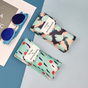
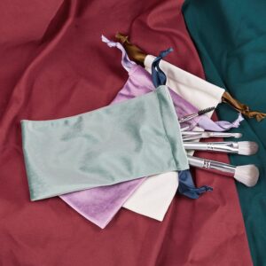
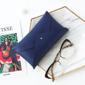
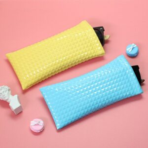
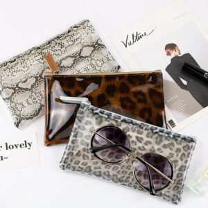
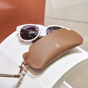
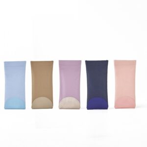
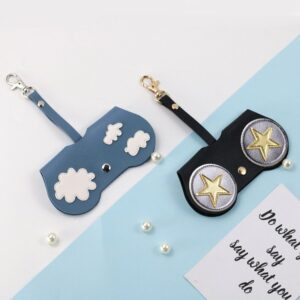
Because for a women’s designer eyewear brand, people are not only reading the product. They are reading the atmosphere around it. The fit. The finish. The color depth. The packaging. The way the collection sits together as one clear point of view.
That is where a lot of promising launches start to feel weaker than they should.
Nothing is necessarily wrong.
The frames may still look good.
The palette may still make sense.
The brand story may still be there.
But the final impression feels a little unfinished.
A little less elevated.
A little less ready for the kind of retail space the brand wants to enter.
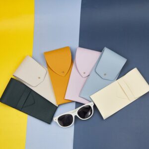
We saw that clearly in a project with Lune & Form, a women’s designer eyewear brand from London.
The brand already had direction.
It had a refined visual world, a feminine but controlled design language, and a clear idea of how it wanted to be seen.
What it needed was not more styling.
It needed the launch to feel more complete.
Because in this category, a strong frame is only part of the story. The real difference often comes from whether the product, the presentation, and the brand mood all speak in the same voice.
That is what this article is about.
Not how to make a women’s collection look more decorative.
But how to make it feel more whole by the time it reaches the market.
Because for a premium launch, that is often what people notice first.
Part 2. Why a Women’s Eyewear Launch Can Feel Incomplete Even When the Frames Look Good
This happens more often than people expect.
A brand may already have strong shapes.
The color direction may already be attractive.
The samples may already look polished enough in photos.
And still, when everything is placed together, the launch does not feel fully convincing.
That is because a women’s designer eyewear collection is rarely judged frame by frame alone. It is usually read as a whole atmosphere.
People notice whether the fit feels refined.
Whether the colors have enough depth.
Whether the finish feels aligned with the price point.
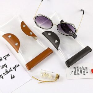
Whether the packaging supports the product or pulls it backward.
When those parts are not fully connected, the launch starts to feel fragmented.
The product may be good.
The branding may be good.
The packaging may be acceptable.
But they are not yet building one clear impression together.
And that matters a lot for an emerging women’s brand.
Because premium positioning in this space often depends on cohesion. Not loudness. Not over-design. Just the feeling that everything belongs to the same brand world.
That was exactly the kind of gap Lune & Form was starting to feel. The taste was already there. What the launch needed next was more completeness.
Part 3. A Strong Frame Does Not Automatically Create a Strong Launch
This is where many emerging brands start to feel the gap.
The product may already be attractive.
The collection may already have taste.
The visual direction may already feel premium.
But once the brand gets closer to launch, another standard appears.
Not just whether the frames look right.
Whether the whole release feels ready.
That is a different question.
A frame can be elegant and still not feel fully refined on face.
A color can be beautiful and still not carry enough depth in the finished product.
A package can be clean and still not support the same level of positioning as the eyewear itself.
And when those things do not align, the launch starts to feel weaker than the design deserves.
That is especially true in women’s designer eyewear.
Because the collection is often doing more than selling product. It is introducing a mood, a lifestyle, a sense of refinement. If the fit, finish, color story, and presentation are not moving in the same direction, the brand impression becomes less clear.
That is why a strong launch needs more than good frames.
It needs cohesion.
And that was exactly the stage Lune & Form had reached. The brand already had a clear aesthetic. What it needed next was stronger alignment between product, presentation, and overall brand feeling.
Part 4. Where Lune & Form Started to Feel Less Complete Than It Should
When Lune & Form came to us, the brand was not missing taste.
That part was already clear.
The collection had a feminine but controlled direction, with a softer premium mood and a visual world that felt thoughtful from the beginning. The shapes were attractive. The color story already had promise. The brand knew how it wanted to be seen.
The problem was not the concept.
The problem was that the launch was not yet coming together as one complete impression.
Some frames looked strong on their own, but the fit was not always refined enough once they were on face. Some colors worked in theory, but the finished product did not always carry the same depth or quiet polish the brand needed. The packaging was functional, but it was not yet helping the collection feel more elevated and fully resolved.
That is the tricky part with a women’s designer eyewear launch.
The pieces can all be good.
But the whole thing can still feel slightly unfinished.
Not weak.
Not confused.
Just not fully aligned.
And once that happens, the launch starts losing some of its premium effect. The product may still be attractive, but the brand does not land as clearly as it should.
That was where Lune & Form was.
The direction was already there.
What the launch needed next was more cohesion.
Part 5. Where the Launch Started to Feel Uneven
The issue was not one major problem.
It was a collection of smaller gaps.
That is often how a women’s eyewear launch starts to lose strength. Not because the brand lacks taste, but because the final experience is not yet moving together in one clear direction.
One of the first gaps was fit.
Some frames looked elegant on the table, but once worn, they did not always deliver the same level of refinement. In a women’s collection, that matters a lot. A shape can be beautiful in concept and still feel less polished than expected once it is actually on face.
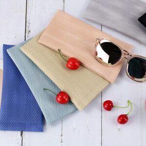
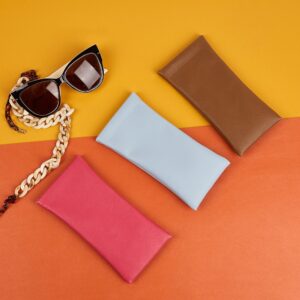
Color was another issue.
The palette was already attractive, but some tones were not carrying enough depth in the finished frame. The idea was right, but the product was not always holding the same quiet premium mood the brand wanted.
The finish also needed more control.
The frames were clean, but some details still felt a little too standard. Not enough to look wrong. Just enough to keep the product from feeling fully elevated.
Then there was the packaging.
It worked, but it was not yet reinforcing the collection strongly enough. The product and the presentation were not fully building the same brand impression.
That was the real gap.
Not between a good launch and a bad one.
Between a promising launch and a fully resolved one.
And for a brand like Lune & Form, that difference was important.
Part 6. What We Adjusted
The goal was not to change the identity of the collection.
Lune & Form already had a clear aesthetic. The shapes were right, the mood was right, and the brand already knew the kind of retail space it wanted to enter. What the launch needed was not more design.
It needed stronger alignment.
We started with fit.
Some frames looked elegant as objects, but they needed more refinement once worn. So the work here was about helping the shapes feel better on face, not just look good on a sample tray. In a women’s collection, that difference is important. A frame has to carry the same sense of polish when worn as it does in concept.
Then we looked at color.
The palette was already strong, but some tones needed more depth and better control in the finished product. The aim was not to make the colors louder. It was to help them feel richer, softer, and more in line with the brand’s premium mood.
Finish was another important point.
The frames were clean, but they needed a more resolved surface quality so the product could feel more elevated overall. That meant removing some of the more standard supply feel and bringing the details closer to the level of refinement the brand positioning required.
We also worked on the packaging presentation.
Not as a separate item, but as part of the launch experience. The packaging needed to support the frames, not simply contain them. It had to feel like it belonged to the same brand world.
That was the overall direction.
Not a redesign.
Not a bigger statement.
Just a more complete one.
Part 7. What Changed After the Launch Became More Cohesive
The collection did not become louder.
It became more complete.
Once the fit felt more refined, the colors carried more depth, the finish became more controlled, and the packaging started supporting the same mood as the frames, the whole launch felt different. It no longer looked like a set of attractive products still trying to come together.
It started to feel like one clear brand statement.
That shift matters.
Because before that point, the collection had beauty, but not always enough unity. Some parts were stronger than others. Some details carried the brand well, while others still felt a step behind.
After the adjustments, the impression became much more consistent.
The frames felt more polished on face.
The colors felt softer and richer.
The overall presentation felt more aligned with the product.
And that changed how the launch was received.
The collection no longer needed to rely so heavily on explanation. It started doing more of the brand work on its own. Buyers could see the direction more clearly. The product, the packaging, and the mood were finally reinforcing each other instead of competing for attention.
That is when a launch starts to feel premium in a more convincing way.
Not because any one detail is dramatic.
Because everything begins to feel like it belongs together.
And that was exactly what Lune & Form needed.
Part 8. What Women’s Eyewear Brands Should Check Before Launch
A women’s eyewear launch is easy to approve too early.
The frames look good.
The palette feels right.
The packaging is ready.
Everything seems close enough.
But “close enough” is often where a premium launch starts to lose power.
Because this kind of collection is not judged only by product design. It is judged by the full impression it creates.
So before launch, the first question should be:
Do the frames still feel refined when worn, not just when displayed?
That matters a lot. A shape can look elegant on a tray and still feel less polished once it is actually on face.
The second question is:
Do the colors carry enough depth in the finished product?
A good palette on paper is not enough. The real test is whether the tones still feel rich, soft, and brand-right once they become full frames.
The third question is:
Does the finish really support the positioning?
If the details still feel too standard, the collection may remain attractive without feeling fully premium.
And the last question is:
Does the packaging strengthen the product, or just accompany it?
For a women’s designer launch, packaging is part of the first impression. It should help complete the brand mood, not sit outside it.
That is what launch approval should protect.
Not just whether the pieces are ready.
Whether the whole release feels complete enough to enter the market with confidence.
Part 9. Why Women’s Designer Brands Need More Than a Product Supplier
A product supplier can make the frames.
That does not always mean they can help complete the launch.
For a women’s designer eyewear brand, that difference matters.
Because once the design language is already clear, the next challenge is not usually about creating more ideas. It is about making sure every part of the launch supports the same impression. The fit, the finish, the color depth, the packaging, and the overall presentation all need to move in one direction.
A standard supplier usually focuses on execution:
Can the frame be produced?
Can the color be matched?
Can the packaging be delivered on time?
Those things matter.
But they are not the whole job.
A growing women’s brand also needs someone who can judge whether the launch feels coherent enough to support premium positioning. Whether the frames are refined enough on face. Whether the finish is still too ordinary. Whether the packaging is reinforcing the brand or weakening the first impression.
That kind of support is not just production.
It is launch judgment.
And that was the difference in Lune & Form’s case.
The collection did not need a new visual identity.
It needed stronger alignment around the identity it already had.
Because for a women’s designer launch, the goal is not just to present attractive frames.
It is to make the whole release feel complete, elevated, and ready to hold its place in the market.
Part 10. A Premium Launch Has to Feel Complete, Not Just Attractive
A women’s designer eyewear launch is not judged by the frame alone.
It is judged by the feeling it leaves behind.
The shape matters.
The color matters.
The finish matters.
The packaging matters.
But what matters most is whether all of those things come together as one clear brand impression.
That was the real lesson in Lune & Form’s case.
The collection already had taste.
It already had direction.
What it needed was stronger cohesion around that direction.
Once the fit felt more refined, the colors gained more depth, the finish became more resolved, and the packaging started supporting the same mood as the frames, the launch no longer felt like a promising first step.
It felt like a real premium release.
And that is the difference that matters.
Because for an emerging women’s brand, the goal is not just to put beautiful products into the market. It is to make the market feel that the brand is ready.
Ready for better retail accounts.
Ready for stronger customer trust.
Ready to be seen as more than a good idea.
That is what a complete launch does.
Not more decoration.
Not more noise.
Just a clearer, more unified impression from the first frame to the final presentation.
For brands like Lune & Form, that is what turns a good collection into a stronger brand moment.