Standing out in the eyewear industry, where competition is fierce, can be quite a challenge. Many eyewear brands struggle to create a logo that not only looks unique but also communicates their brand values clearly.
Without a unique and well-designed logo, brands risk blending in with the crowd and missing out on crucial opportunities to make a lasting impression on potential customers. A poorly designed logo can lead to customer confusion, lack of trust, and ultimately, lost sales.
By following a series of structured steps, you can design a logo that not only reflects your brand’s identity but also sets you apart from competitors. A strong logo will act as a visual ambassador for your brand, reinforcing customer loyalty and helping you carve out a distinctive place in the market.
What are the Key Steps to Designing a Unique Eyewear Logo?
Designing a unique eyewear logo involves understanding your brand’s essence, choosing the right visual elements, and ensuring flexibility across various applications. Here are the key steps to follow:
1. Understanding Brand Identity

Before diving into logo design, it’s crucial to define your brand’s identity. Are you targeting a luxury market, a trend-setting crowd, or a more practical, function-focused audience? The brand’s positioning will guide the logo’s design style.
Tip: Make sure the logo reflects your brand’s core values. For example, luxury brands might opt for minimalist, elegant designs, while a trendy, youthful brand could choose something bold and vibrant.
2. Choosing the Right Font

Typography is a fundamental element in logo design, especially for eyewear brands where the logo may be applied to small surfaces like temple arms or lens corners. The font needs to be distinctive yet legible, representing the style and tone of your brand.
Tip:
- High-end brands often prefer clean, classic sans-serif fonts.
- Trendy or fashion-forward brands might opt for custom or handwritten fonts to stand out.
3. Combining Graphics with Symbols
Incorporating graphics or symbols can enhance the recognizability of your eyewear logo. Eyewear brands often use icons related to glasses, such as frame outlines or lens shapes, to create a visual association with the product.
Tip: Ensure that any graphic elements are simple and memorable. Overly complex designs might be hard to recognize when scaled down.
4. Simplicity and Uniqueness
The key to a great logo is balancing simplicity with uniqueness. Simple logos are not only easier to remember but also work better across various mediums and sizes, from business cards to billboards.
Tip: Avoid cluttering the design with too many elements. Focus on a singular concept that represents your brand well, and ensure the logo remains identifiable even when scaled down to a smaller size.
5. Color Choice
Colors play a vital role in conveying emotions and brand messages. When choosing colors for your eyewear logo, consider the overall brand aesthetic and how you want customers to feel when they interact with your brand.
Tip:
- Luxury brands often stick to neutral colors like black, white, or gold to communicate sophistication.
- Youthful or trendy brands may use vibrant colors to create an energetic and playful vibe.
- Tech-oriented eyewear brands can use cool tones like blues and silvers to convey innovation and precision.
6. Flexibility and Versatility
Your logo needs to be versatile enough to fit on various platforms, products, and packaging. Whether it’s printed on a website, a marketing brochure, or engraved on the side of an eyeglass frame, the logo should maintain clarity and impact.
Tip: Make sure your logo works in both color and black-and-white formats. It should also look good in both large and small sizes without losing any detail.
7. Incorporating Brand Story
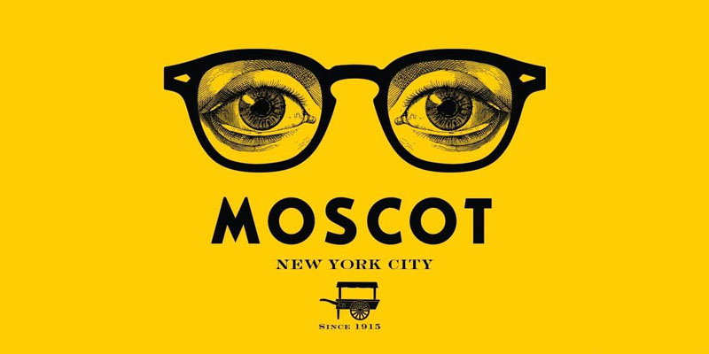
A strong logo often connects with a brand’s story, making it more memorable and emotionally resonant. Consider weaving your brand’s history, mission, or core values into the design.
Tip: Use elements in your logo that symbolize something meaningful to your brand. For instance, a brand focusing on sustainability might incorporate earth tones or nature-related symbols into the design.
8. Highlighting Brand Personality
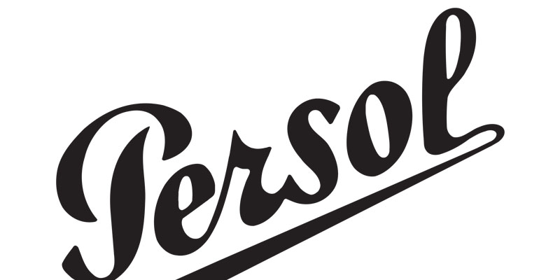
Your logo should visually express the unique personality of your brand. Whether your eyewear is positioned as futuristic, eco-friendly, or classic, the logo must reflect these qualities.
Tip: If your brand is known for cutting-edge design, consider integrating sleek, modern shapes or minimalist aesthetics. If your brand is eco-conscious, a logo with organic shapes or green hues may help communicate that commitment.
9. Designing with Cultural Sensitivity

If your brand has roots in a particular culture or aims to appeal to a specific cultural demographic, integrating cultural elements into the design can make your logo more relatable and impactful.
Tip: You can incorporate cultural symbols or color schemes associated with your brand’s heritage while keeping the overall design modern and universal.
10. Testing and Iterating
Once the logo design is complete, it’s essential to test how it performs across different scenarios. This could involve placing it on various marketing materials, social media, and product packaging. It’s also beneficial to gather feedback from customers or stakeholders to ensure the logo resonates well.
Tip: Don’t hesitate to make adjustments based on feedback. Sometimes, small tweaks in color, layout, or iconography can significantly enhance the overall impact.
FAQs about Eyewear Logo Design
1. How important is font choice in an eyewear logo?
Font choice is crucial because it sets the tone for your brand. It needs to be readable, especially at smaller sizes, and it should reflect your brand’s personality—whether it’s modern, classic, or trendy.
2. Can I use color gradients in my logo?
Yes, you can, but keep in mind that logos with color gradients may not always translate well in all mediums. It’s essential to ensure that your logo is just as effective in a single color as it is with gradients.
3. How can I make my logo timeless?
To make your logo timeless, focus on simplicity and avoid following design trends too closely. Logos with clean lines, minimalistic shapes, and classic fonts tend to stand the test of time.
4. Should I use a tagline with my logo?
It depends on the context. While a tagline can provide more information about your brand, it may clutter the design, especially in small formats like on a product. Keep taglines for larger marketing assets or omit them from the core logo design.
5. How can my eyewear logo convey sustainability?
To convey sustainability, you can use natural color schemes like greens and browns, incorporate eco-related symbols (leaves, trees), or use fonts and shapes that have a natural, organic feel.
6. Should I design my logo myself or hire a professional designer?
If you have design experience, you can try creating it yourself, but hiring a professional ensures a polished and effective result. A designer can help translate your ideas into a functional and visually appealing logo.
7. How can I differentiate my eyewear logo from competitors?
Research competitor logos to avoid overlapping themes. Focus on what makes your brand unique—whether it’s your product materials, style, or mission—and incorporate those elements into your logo.
Final Thoughts
Designing a unique eyewear logo involves more than just creating a pretty picture. It requires a deep understanding of your brand’s identity, careful selection of visual elements, and thoughtful consideration of how the logo will be used across different platforms. With the right approach, your logo will not only capture attention but also communicate the essence of your brand, leaving a lasting impression on your audience.
Get Your Quote Now!
Curious about the cost of custom logo branding for eyewear?
Our competitive pricing ensures you get high-quality logo customization to enhance your brand’s visibility!


